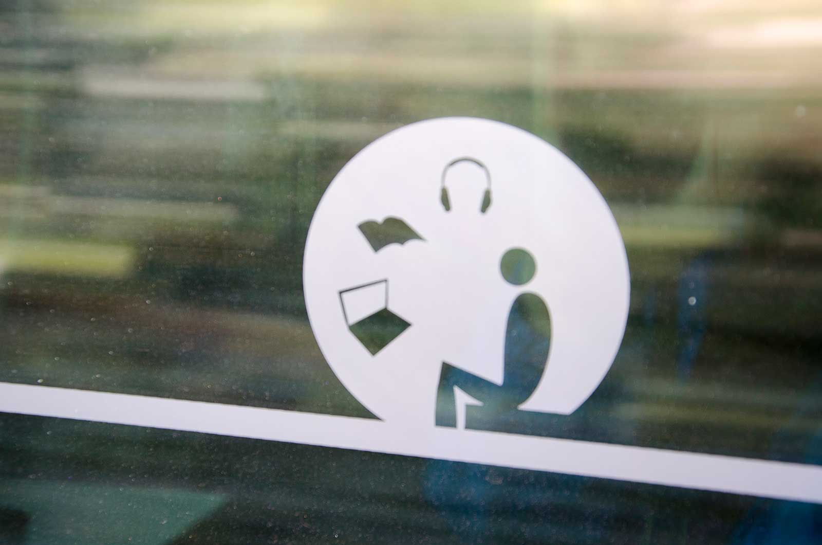
Okay, the picture is slightly blurry. However, the depicted icon is also vague for another reason. Because what does it mean? We see a seated person, a laptop, a book and headphones. But it’s not clear how these four relate to each other.
On the train in which I was travelling, a discussion arose when someone asked two talking ladies to be silent ‘because this is a silence compartment”, pointing at the icon. I was sure that it was not, because that silence compartment was a few compartments away in the same train, with the words “stilte/silence” clearly written on the windwos.
Feedback
When I asked my question on Twitter, Dutch Railways replied within five minutes. Early on a Sunday morning; great invention, this Twitter. Indeed, the icon indicates a silence zone. They told me there are several types of quiet zones on the same train because it was decided to add more than there were originally. But they agreed with me that it was confusing and I was thanked for the feedback. Dutch Railways are going to give it another critical look. That’s good, because silence compartements are a good idea and design icons can be lovely, but it doesn’t work if people have to guess about it.
