A City of Cheese
The City Marketing board of Gouda (yes, home of the famous cheese) recently organized a design competition for a Welcome Wall, composed of canvases with a height of 4 meters and a total length of 63 meters. The structure is going to beautify a windowless wall next to the station. It should, according the contest conditions, evoke a warm and positive image of the city.
Cheese and history
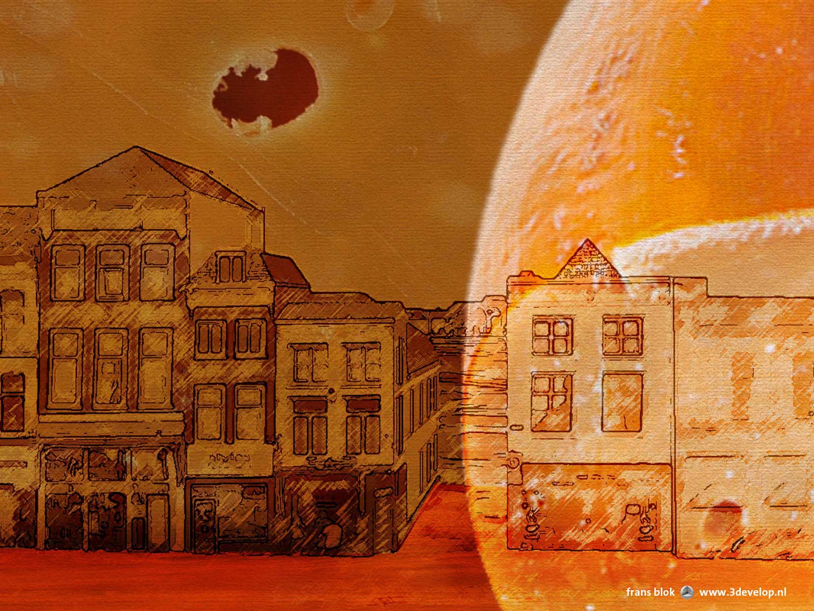
Typical Gouda themes like cheese and cultural history should find their way into the design. I took that last condition quite literally by combining images of all types of Gouda cheese with sketches of the buildings on the famous market square. The scale difference between the sketches and the cheese images creates wonderful patterns and colors that make the design interesting from a distance as well as close up. The little flags that are so often placed on cheese cubes provoke the festive feeling with which Gouda wants to welcome its visitors.
These considerations led to this design:
Here’s a fragment:
Flags
On second thoughts I have some doubts about the little flags, so here are two fragments without them:
The jury has selected three designs that the inhabitants of Gouda will vote about. My design is not among those three, unfortunately. I am very curious which image we’ll see at the railway station in a few months. In the meantime, I’ve got a terrible craving for a piece of old Gouda.
UPDATE: the competition was won by Maaike Hoonhout, photographer and Gouda resident. There’s remarkably little cheese on her entry…


